Too good to go
visual identity
Creative direction · Visual Concept · Implementation
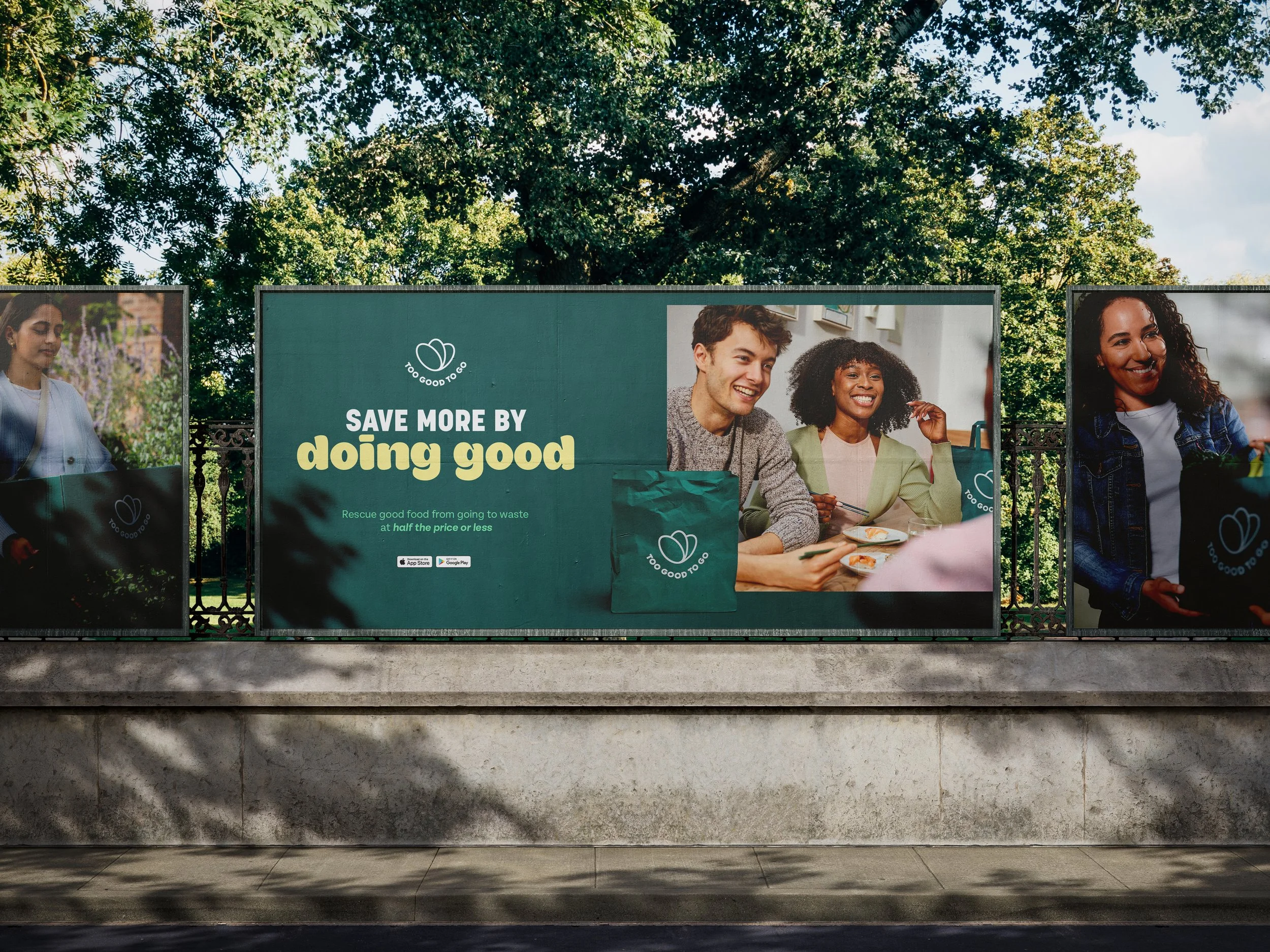
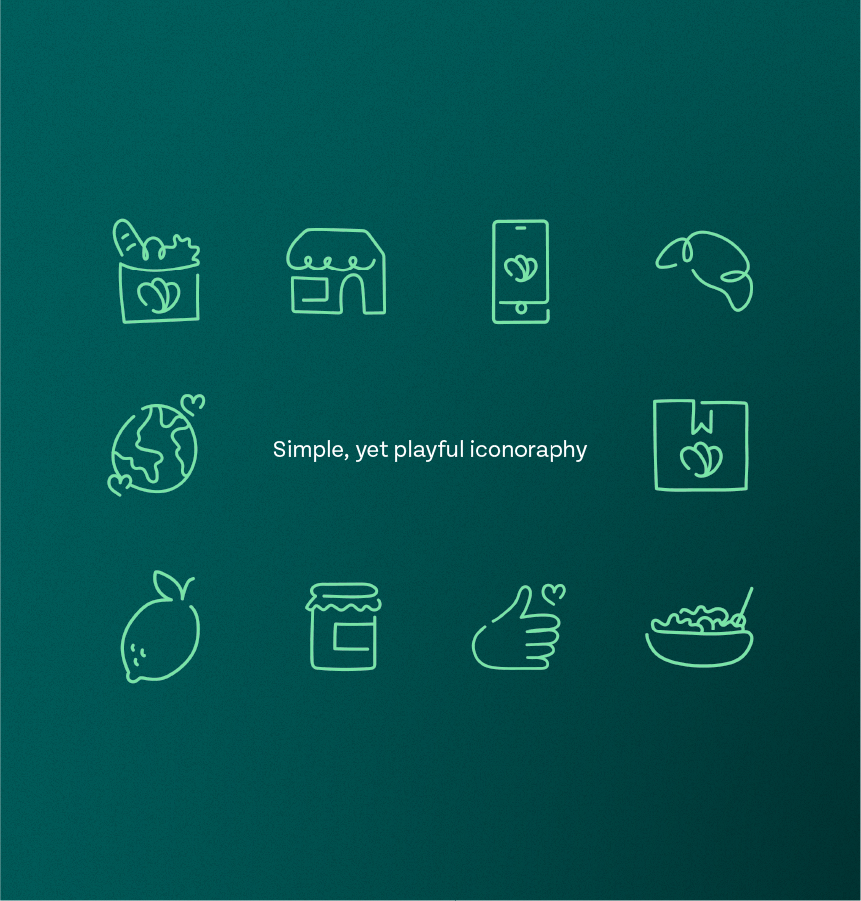
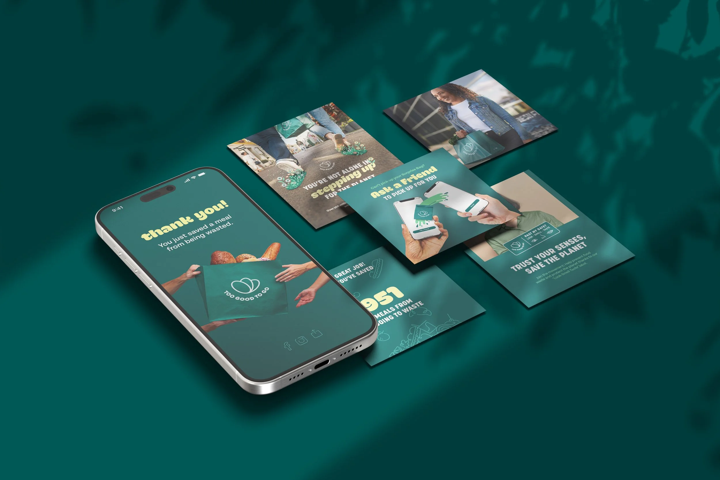
Led and created the complete rebrand of Too Good To Go to reflect a more modern, approachable, and mission-driven identity. From evolving the logo and colour palette to defining new typography, photography, and UI, every element was crafted to feel fresh yet familiar. At the heart of the new visual direction was a desire to celebrate the users — the everyday heroes fighting food waste. Rolled out across 19 markets with a cohesive, flexible design system that strengthened brand recognition and created consistency across all touchpoints — from app to out-of-home.


BACK TO wORKNEXT PROJECT